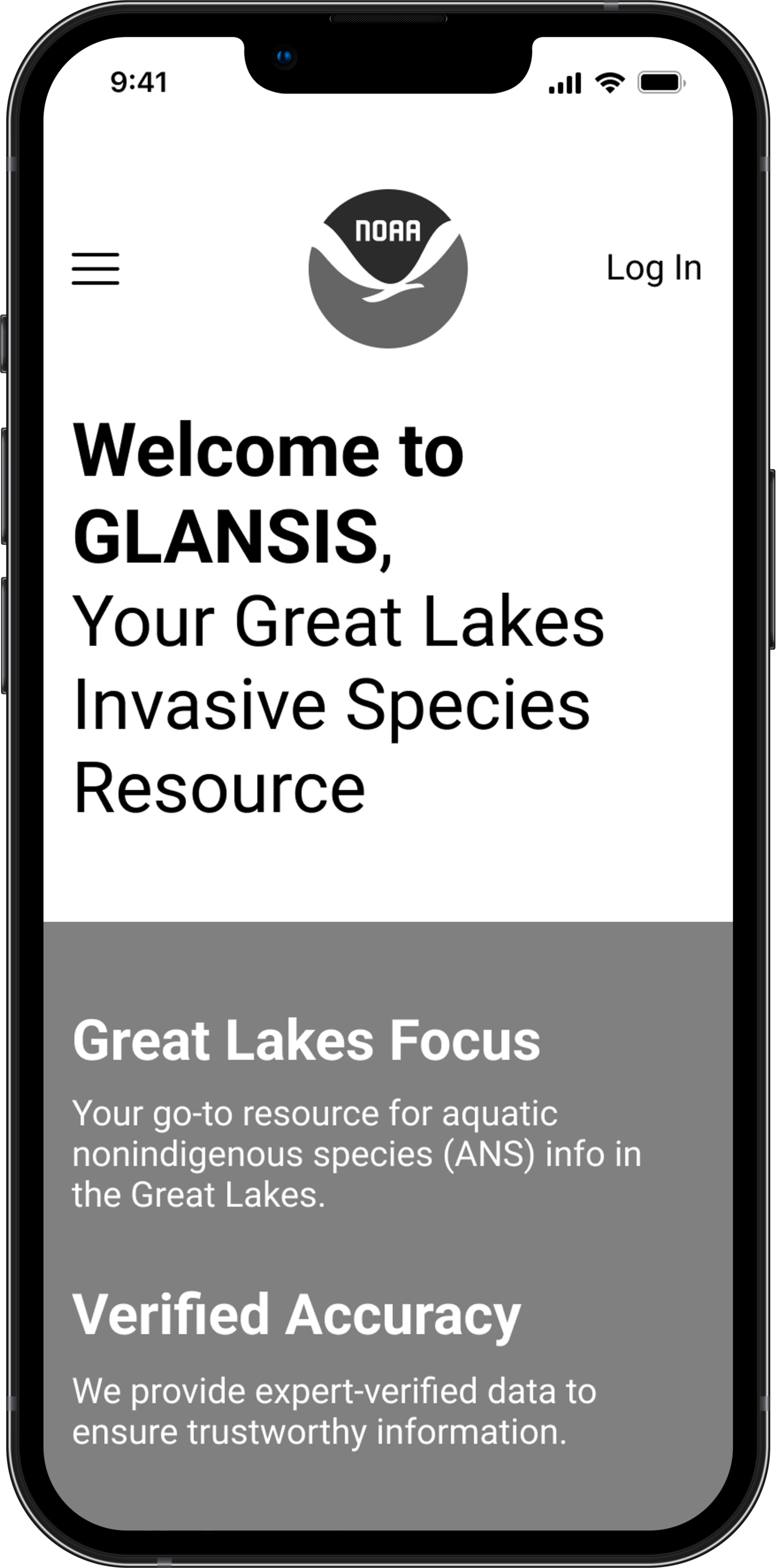
NOAA GLANSIS Website Redesign
Tools
Figma
Type
UX/UI Design
Duration
10 weeks, 2023
Role
Product Designer
This is an SI 307: Introduction to UX course project where I had the opportunity to collaborate with NOAA GLANSIS to improve their website’s user experience. My role was crafting mockups that focused on user needs, enhancing both accessibility and functionality. Through diligent research, wireframing, and prototyping, I developed designs to streamline navigation and ease data retrieval, ensuring they aligned with NOAA GLANSIS's vision and upheld UI design principles for optimal user satisfaction and efficiency.
The Problem
Lessons
GLANSIS NOAA’s website faced 3 key issues:
An outdated design that didn't appeal to modern users
Inconsistent design elements disrupting user experience
Non-intuitive mobile navigation experience
Goals
These shortcomings highlighted the need for a holistic redesign to modernize the look, unify design components, and improve mobile navigation, ultimately boosting user satisfaction and engagement.
The Solution
Home Page
Database Landing Page
Species Profile Page
The Reflection
Lessons
Working on the NOAA GLANSIS project has been a pivotal experience in my UX design journey. This project allowed me to deeply understand the nuances of designing for scientific data platforms. I learned the importance of presenting complex information in an accessible and user-friendly manner. Balancing the needs of diverse user groups, from researchers to policy-makers, honed my skills in creating adaptable and intuitive user interfaces.
Improvements
Enhanced Data Visualization
To make complex aquatic species data more comprehensible, I plan to implement advanced visualization tools. This includes interactive maps with zoom-in features for localized data and dynamic graphs that can display temporal changes in species populations.
User Testing with Specific Groups
Targeted user testing will be conducted with distinct groups: environmental scientists, policy advisors, and educators. This will provide detailed feedback on how each group interacts with the platform and what specific tools and features they find most useful.


